The Tallinn Central Library offers far more than books. As a key cultural and educational hub, it provides digital resources, equipment lending, cultural events, and learning programs to a broad user base. The aim of this project was to improve the user experience of the Library's website, making it easier to navigate, more accessible, and better aligned with the needs of a diverse audience.
The website serves a wide demographic - both new and returning users aged 20 to 60-with varying digital skills and interests. However, the existing platform presented several usability challenges: complex navigation with up to five layers, poorly structured content, lack of features, and overwhelming information density.
The primary goal was to create a more user-friendly and inclusive digital experience while maintaining the formal structure expected of a public service platform. My focus was on the desktop version of the website, which is most commonly used by visitors for checking the e-catalog, finding event information, and accessing digital services.
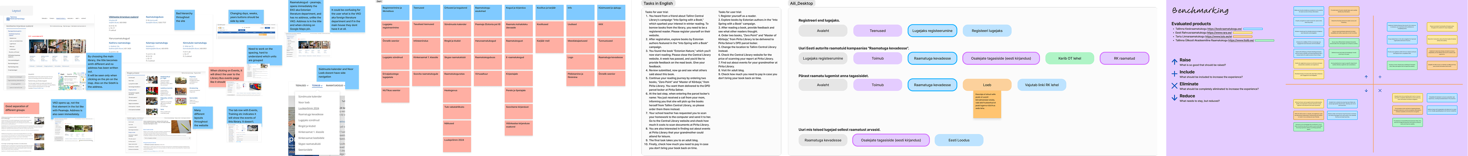
The redesign process followed a user-centered approach, addressing known challenges through research, analysis, and iterative design. This included desk research, expert reviews, user testing, card sorting, benchmarking, and an accessibility audit. Based on these insights, I implemented several key improvements:
This project followed the typical UX design process: Empathize, Define, Ideate, Prototype, and Test - although I won't go into each phase in detail here.
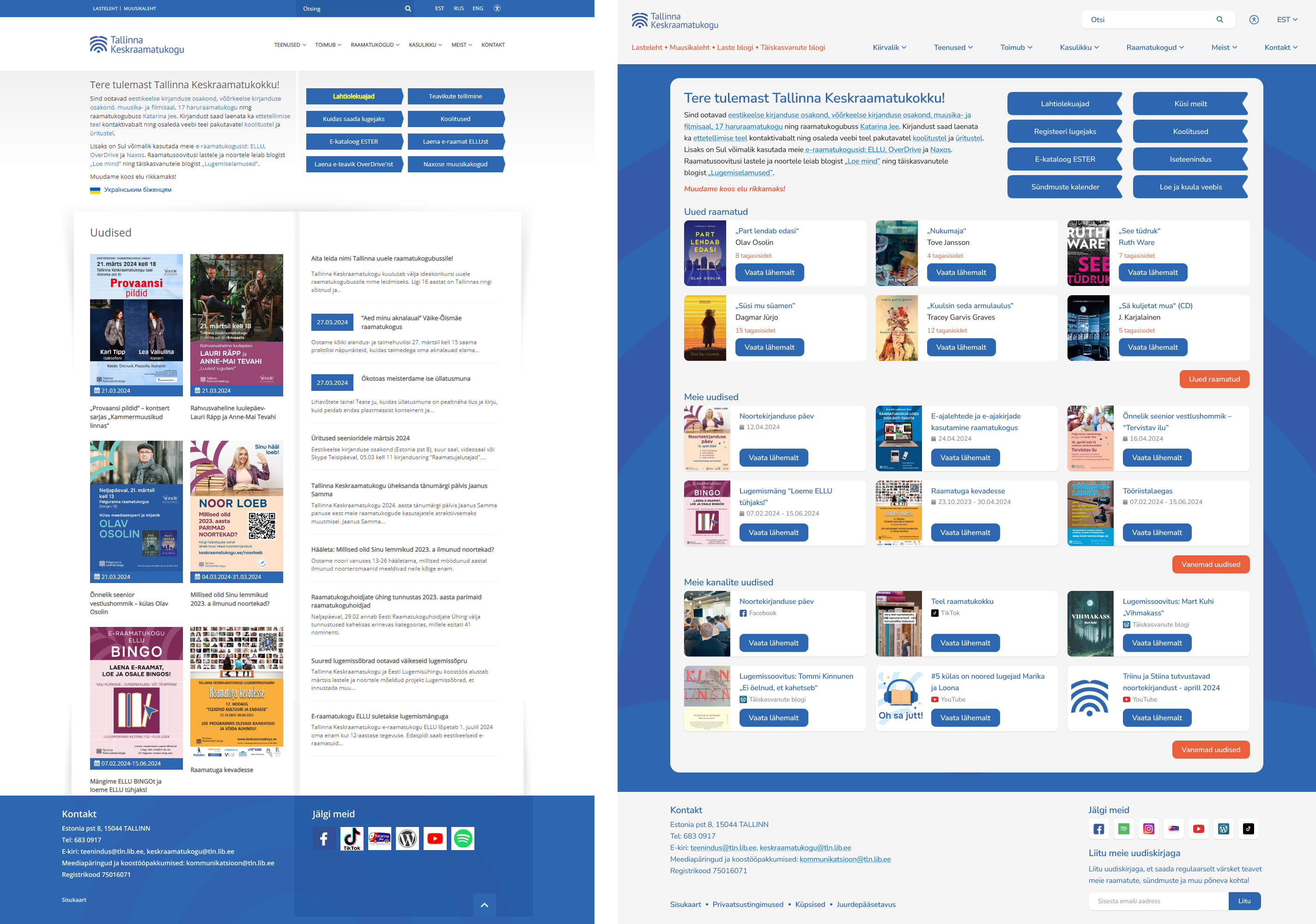
1. Homepage organization: The homepage lacked clear organization, making it challenging for users to find relevant information easily. I will begin by addressing the core of the website - the homepage. While updating its visual appearance to better align with the Library's new image, I also focused on restructuring and refining the information presented. In collaboration with the Library, we changed the call-to-action button names to better cater to user needs, and I also gave them the visual appearance of bookmarks. Furthermore, I reorganized the news section and introduced two new sections, 'New books' and 'Latest updates from our channels', as per the Library's request. Each section now highlights the six most recent posts, with additional content accessible by clicking the 'More' button.
2. Page navigation difficulty: Users faced challenges navigating the website due to complex navigation structures, resulting in confusion about where to find specific content.
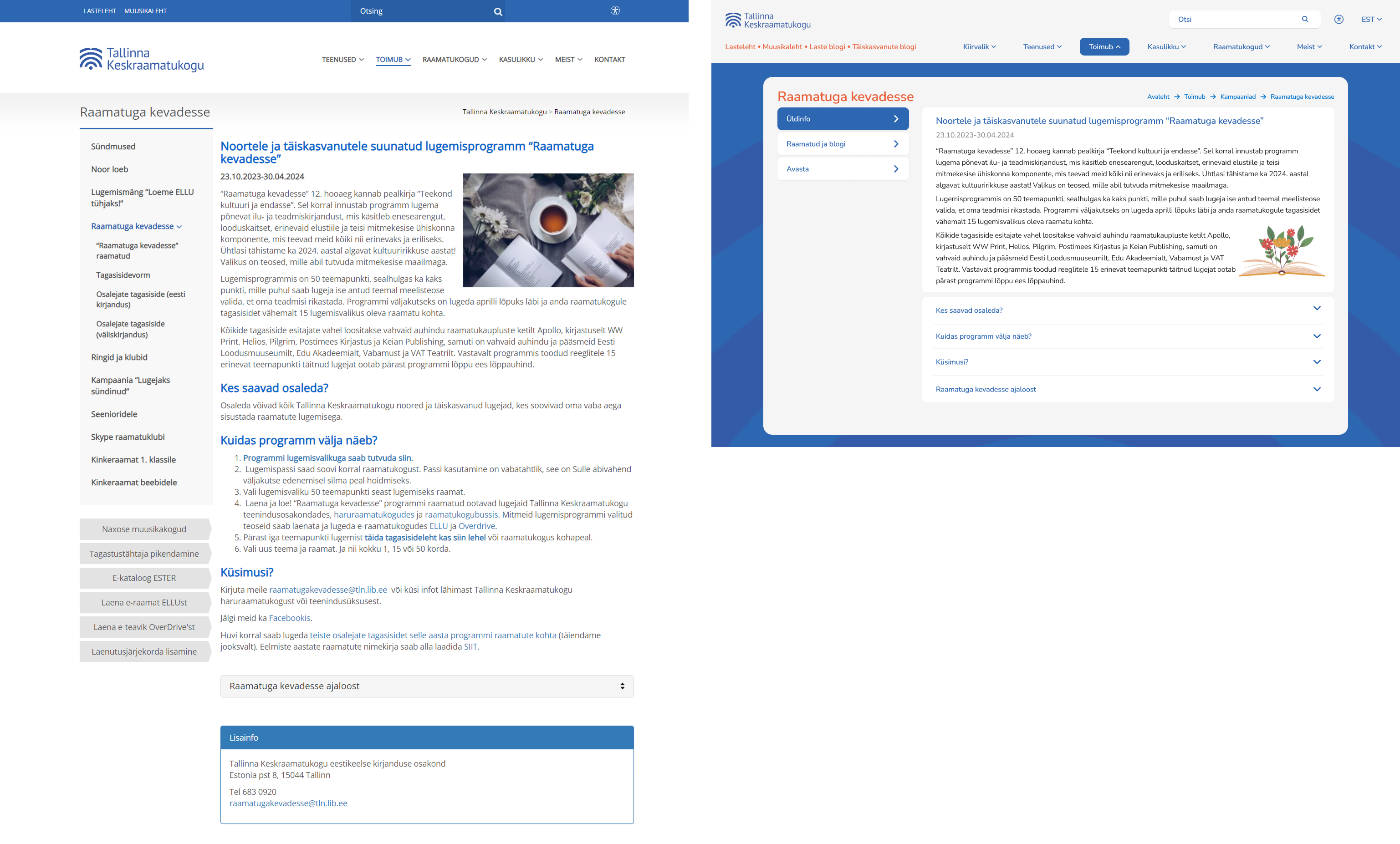
One example of the navigation difficulty is the campaign page. It is one of the most used pages for the readers, drawing considerable interest each year. However, during the research phase, I identified significant usability challenges: the extensive side menu hides various topics, making it difficult for users to navigate effectively and the overall structure and flow of the page lacked intuitiveness.
To address these issues, I simplified the content organization by combining the number of topics from 5 to 3, ensuring that all essential information is presented within three comprehensive categories. Previously, the main page contained a wealth of information, alongside two separate dropdown options. In the updated version, I restructured the content to present basic information upfront, with dropdown options available for users who wish to delve deeper into specific details. This approach simplifies the user experience and enhances accessibility to campaign information.
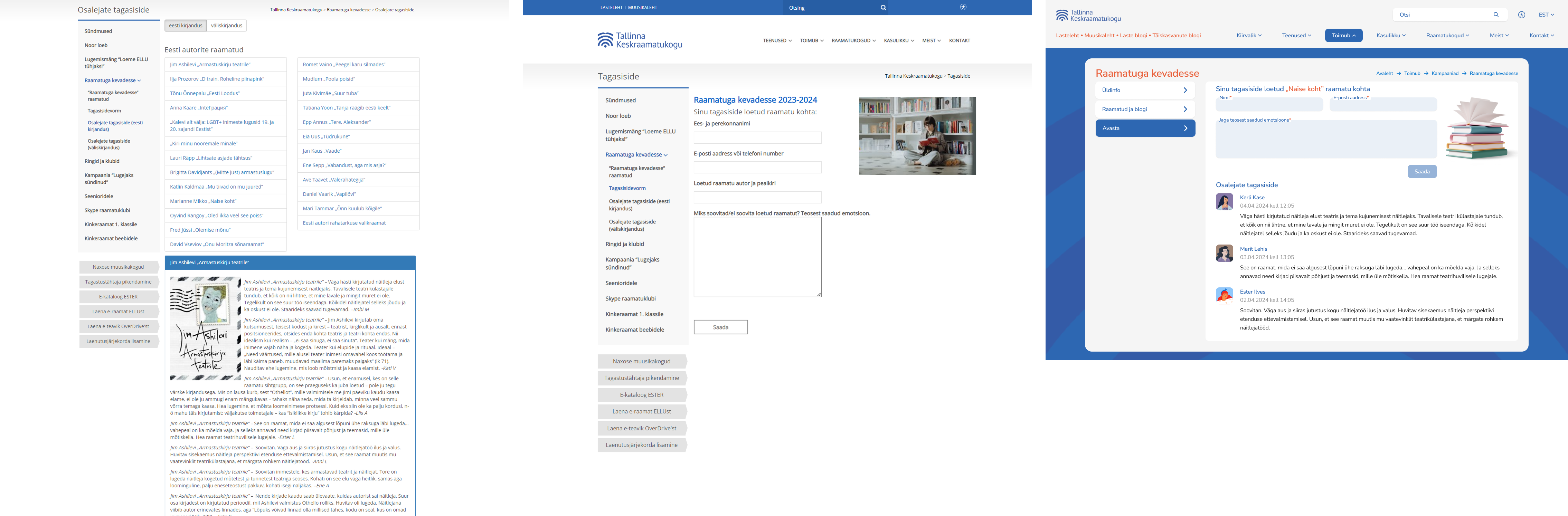
The feedback section has undergone a significant transformation, now adopting a blog-style layout for enhanced user experience. Previously, the feedback form, feedback list, and user comments were spread across three separate pages, requiring users to navigate through multiple clicks. Now, these elements have been consolidated into a single, simplified page, as shown in the third photo. The updated feedback section not only simplifies navigation but also improves readability, achieving the clean and blog-like aesthetic envisioned by the Library and personas.
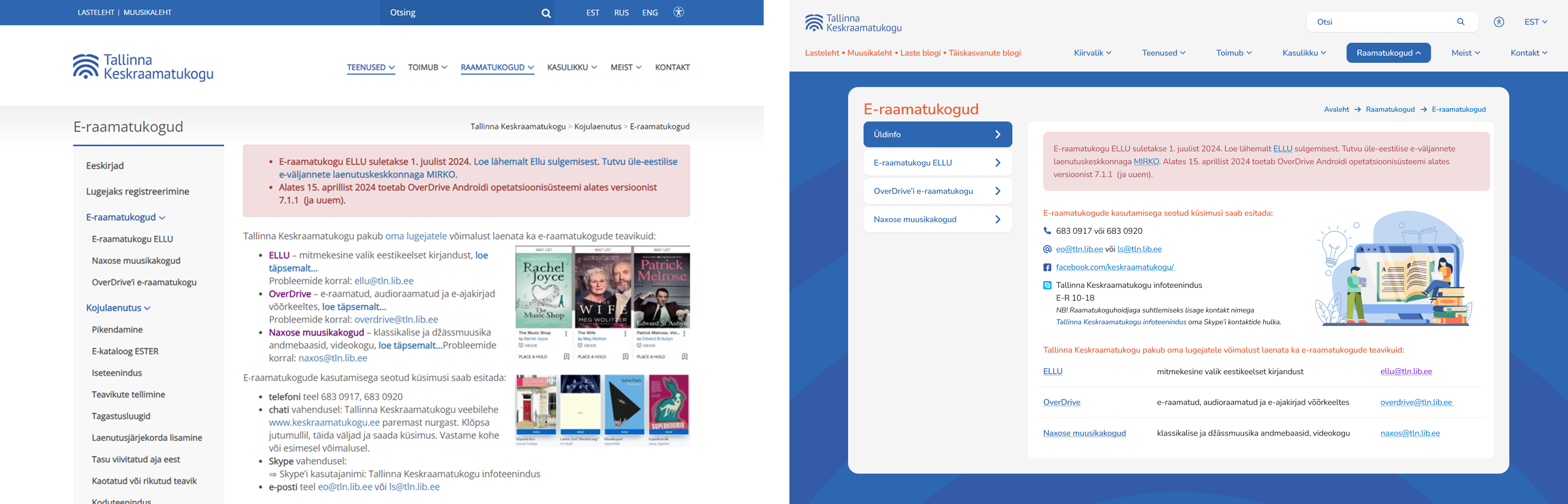
3. Page structure clarity: Several pages lacked clear structure and intuitive layout, making it difficult for users to understand the flow of information. To showcase how I improved the page structure clarity, I will show two examples: " E-libraries" and " Get in touch" pages. Previously, the information page for e-libraries was cluttered with text in various styles, as discussed in the previous chapter. Now, I've separated the main information onto its own page, providing details on how to contact e-library services. To enhance clarity and visual appeal, I introduced icons and removed unnecessary names such as phone numbers and email addresses. Additionally, the e-library overview now features a clear list view format, consistent with other pages. This ensures that titles, linked titles, paragraph text, and clicked/unclicked links are clearly differentiated for improved readability and navigation.
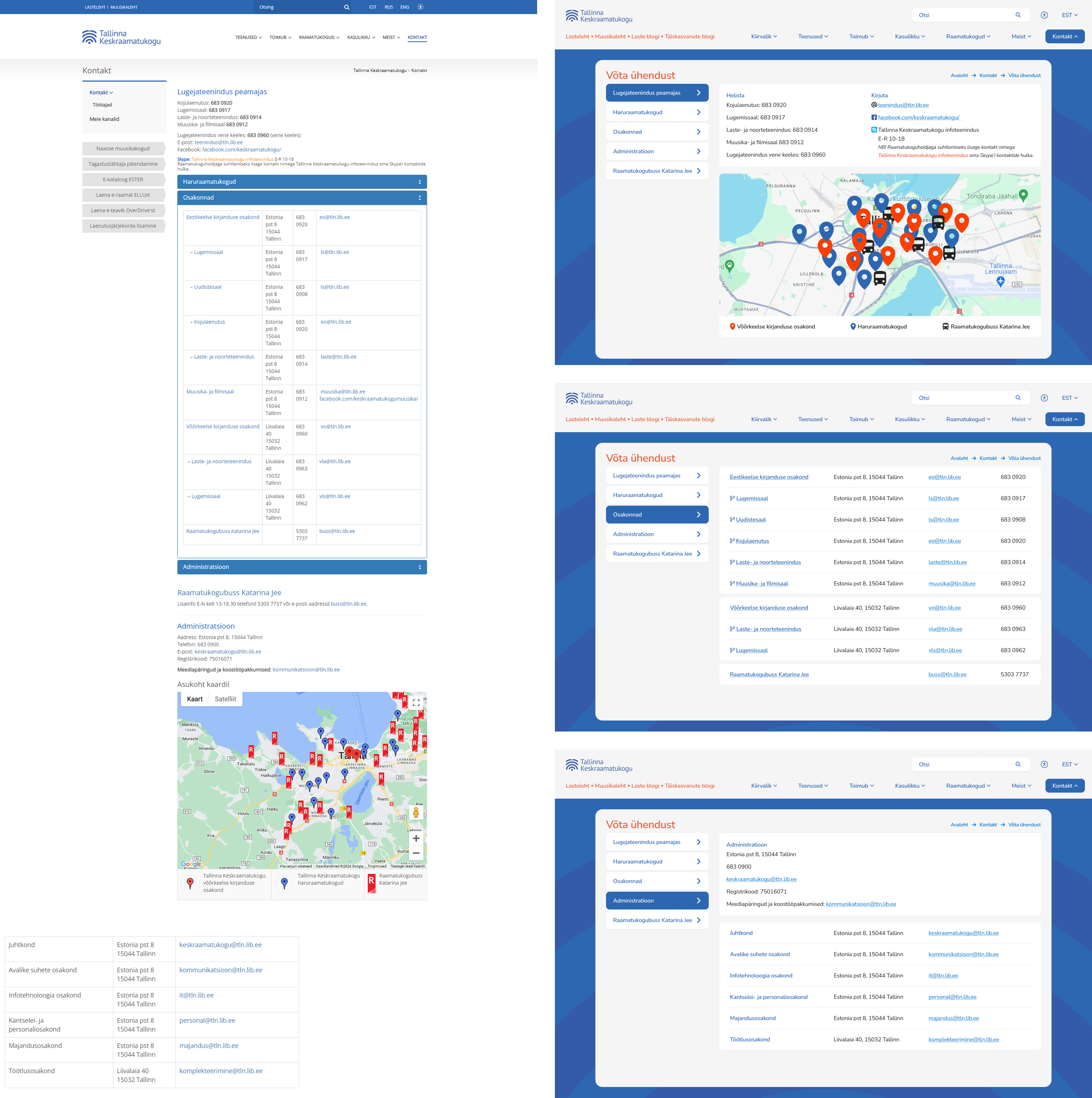
The second example, formerly labeled "Contact," has been renamed "Get in touch" to improve user navigation clarity. Previously, the "Contact" section lacked subcategories in the main menu, causing confusion. By renaming it and integrating subcategories directly into the main menu, users can now access relevant information more easily without navigating through additional menus.
To improve the page structure clarity I also redesigned the whole page. Previously, six subjects were listed on a single page, resulting in clutter and difficulty in highlighting important information. To address this, I divided them into separate topics, and put them on the left topic selection, as seen also on other pages. This restructuring enables better emphasis on essential information, particularly since the other topics mainly consist of extensive contact detail lists.
Furthermore, I focused on improving alignment and spacing throughout the page layout, ensuring consistency in color schemes for enhanced visual appeal, since before there were 5 different colors. Additionally, I integrated icons into the "Write us" options to improve visibility and quicken user navigation.
In the second image, can be seen that information is now presented in a clear list view format, maintaining uniformity across all sections. Each entry includes important details such as addresses, emails, and phone numbers, facilitating easy reference for users. Moreover, instead of adjusting spacing within different departments, I introduced branch icons to signify their association with the main department. This simplifies navigation and enhances overall page aesthetics.
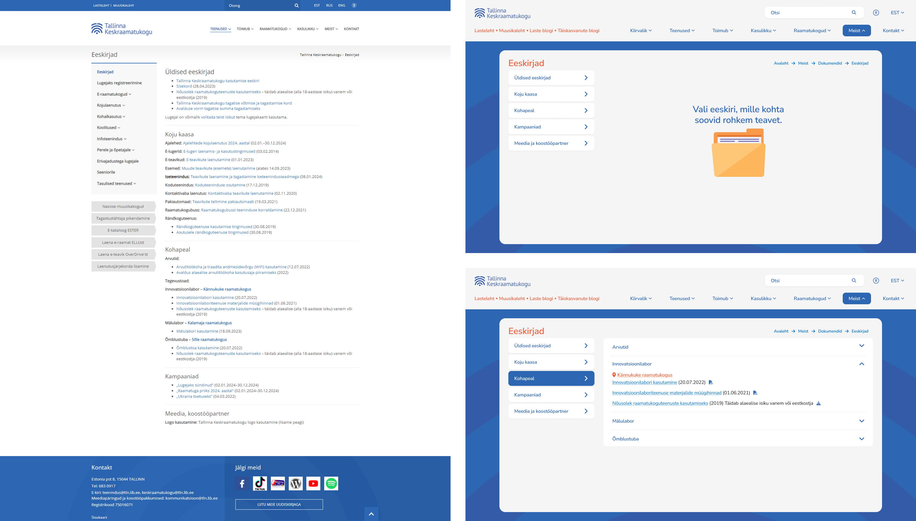
4. Information presentation: Long lists, unclear categorization and inconsistencies in presenting information made it challenging for users to locate relevant data easily. To show how I improved the information presentation on the new website, I will present the "Regulations", "Our staff", and "FAQ" pages. First off, the Library encountered difficulties in presenting necessary documents clearly to users, prompting me to address this
challenge. One issue was the abundance of documents spread across different main categories, leading to confusion. To simplify this, I combined all documents under the "About us" category and created a dedicated subcategory named "Documents".
Another issue was the lack of intuitive flow when accessing documents. Research revealed that users were uncertain about the outcome when clicking on a link, resulting in frustration. To fix this, I added icons to each document, clearly indicating its action upon clicking. Additionally, I reorganized the layout by placing each category as a topic selector, with dropdowns providing quick access to information without the need for scrolling.
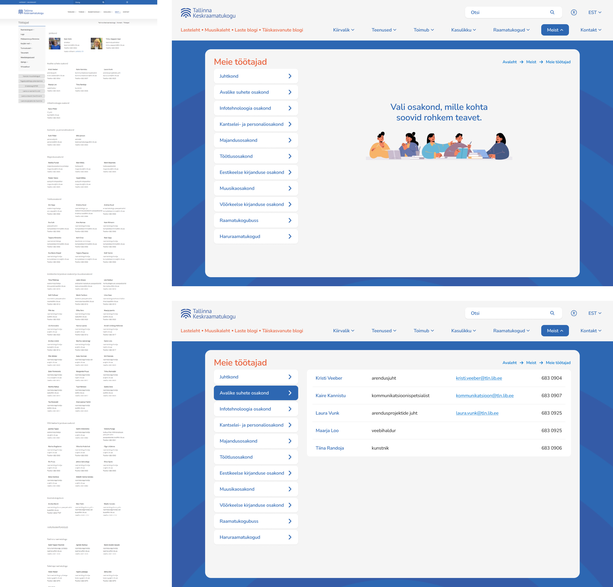
Secondly, the "Our staff" page has been relocated to the "About us" main category, making its placement more intuitive according to the research. Previously, it was inconsistently positioned within both the "Contact" and "Libraries" categories, causing confusion for users.
Two primary issues were addressed: the tedious nature of a long list of names and inconsistencies in design. Previously, all staff members were listed on a single page, resulting in user frustration due to excessive scrolling. To fix this, staff members are now organized by department, accessible through the topic selector. This simplifies the user experience, enabling quick navigation to the desired department without the need for exhaustive searching.
Furthermore, enhancements were implemented to improve layout consistency and clarity. Names are now distinctly separated from other text elements, and links are clearly identifiable. Previously, some names appeared clickable but were not. Now, names appear as plain text and links with underlines and a lighter blue color, clearly indicating their link status for improved user interaction.
Also previously, side menus would open with the first element displayed, causing uncertainty among users. The new empty state directs users to the left topic selection, providing clearer navigation pathways and reducing confusion.
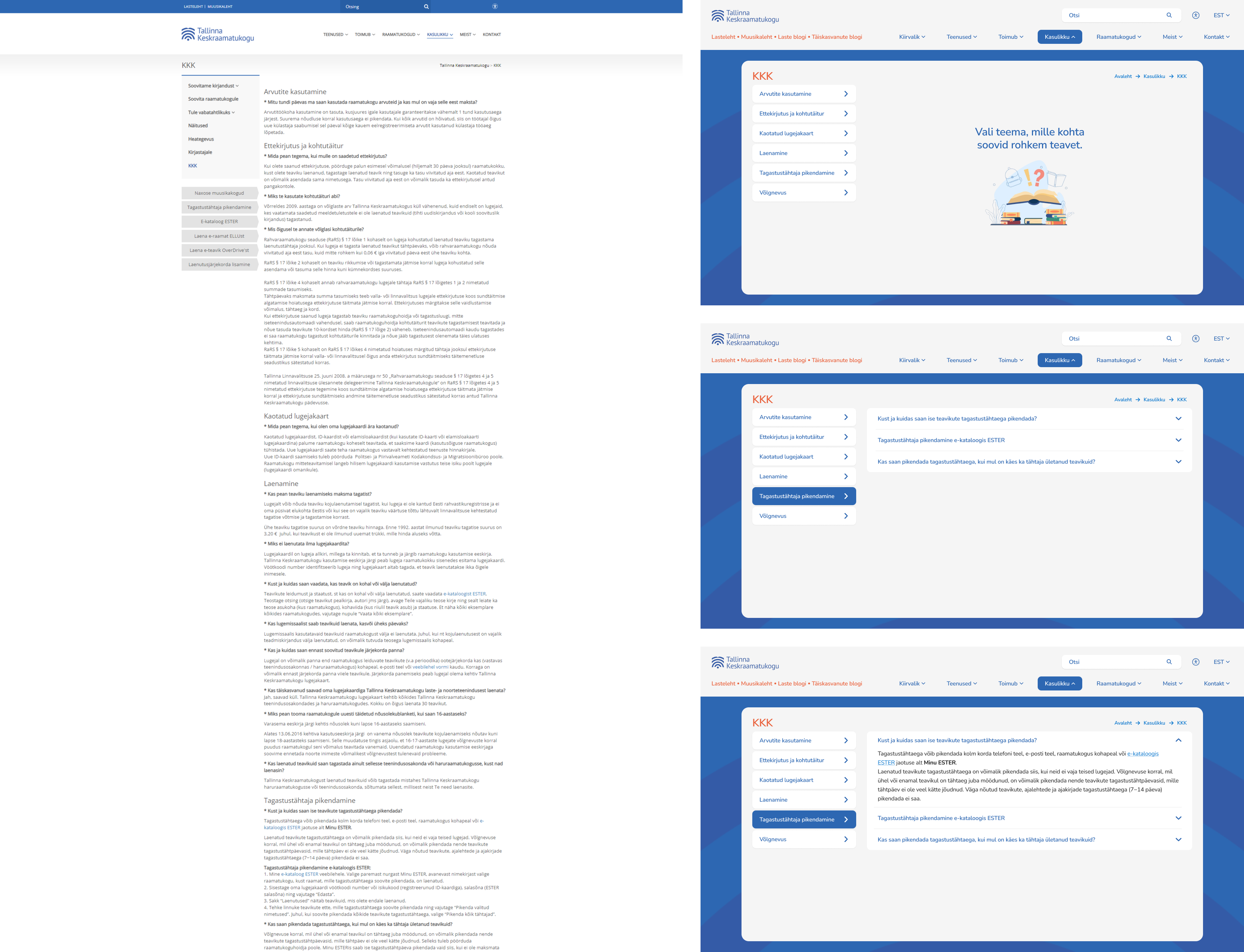
Similar to the previous page, the "FAQ" page underwent a similar transformation. Subjects are now listed in a topic selector, with questions aligned as dropdowns. This replaces the previous format where all content was combined onto one lengthy page, requiring users to scroll extensively.
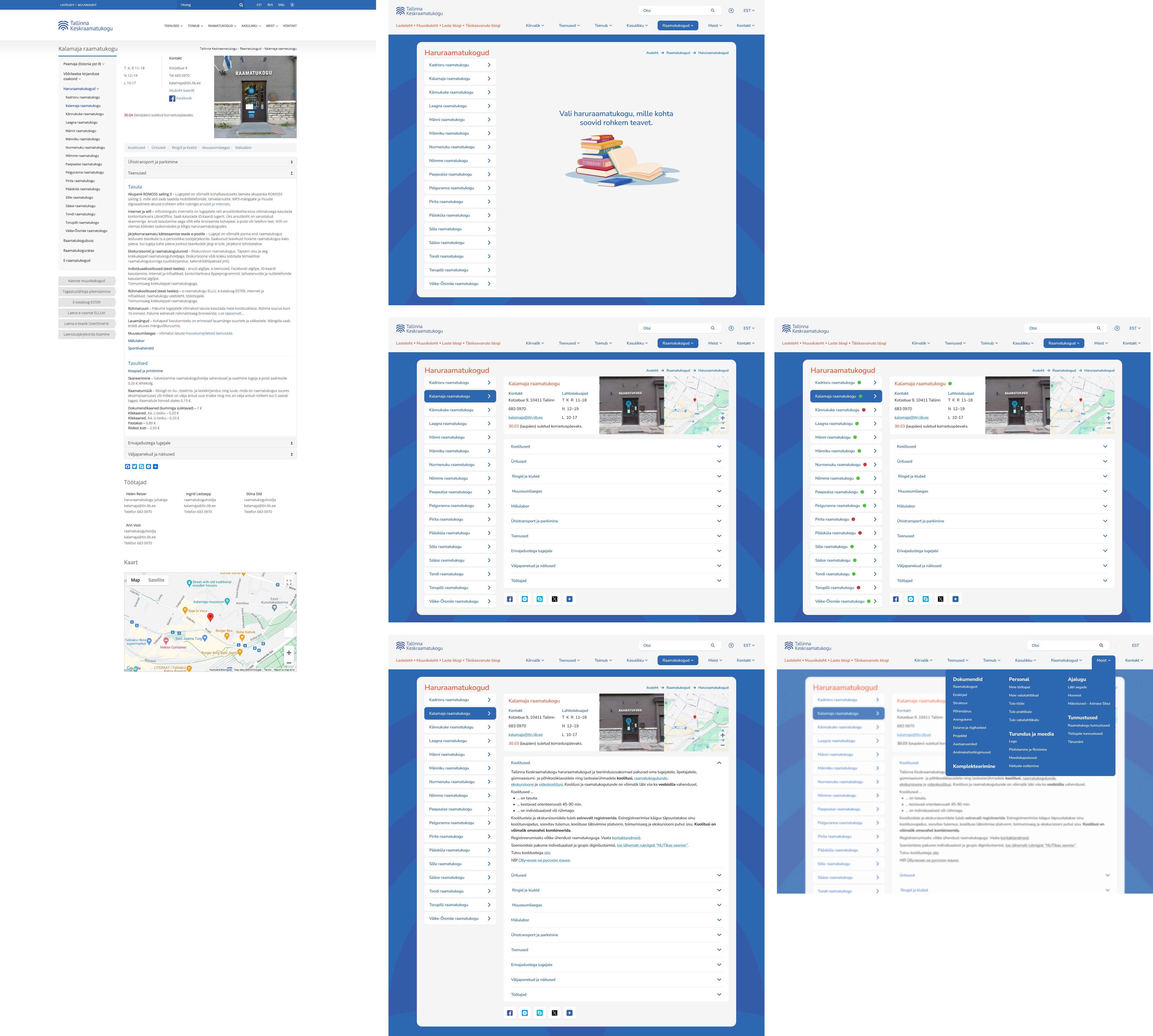
5. Page layout complexity: Many pages featured complex layouts that were overwhelming for users, hindering their ability to navigate effectively.
Finally, let's look at the complexity of page layouts, using the "Branch library" page as an example. The branch libraries section faced two significant issues. Firstly, upon clicking the top menu, users were immediately directed to the first branch library without any prior selection option, causing confusion. This problem was resolved by introducing an empty state, guiding users to explore the available branch options upon clicking the branch library section.
Secondly, there was a multitude of actions available to users, each leading to different outcomes. Users encountered normal text, internal and external links, another menu within the detail page, sharing options, and dropdowns, making navigation
complex. In the updated version, users are presented with a clear overview of basic information, with the option to delve deeper by selecting their desired topic from dropdown menus.
Previously, the flow for the horizontal list beneath the photo involved opening each item on a new page, requiring users to independently locate related information about the branch on a completely new page. This tedious process has been simplified in the new version, providing users with relevant information immediately. Dropdown menus now display relevant information about that specific library, each linked to a new page containing detailed content on the selected topic.